Company Re-Branding
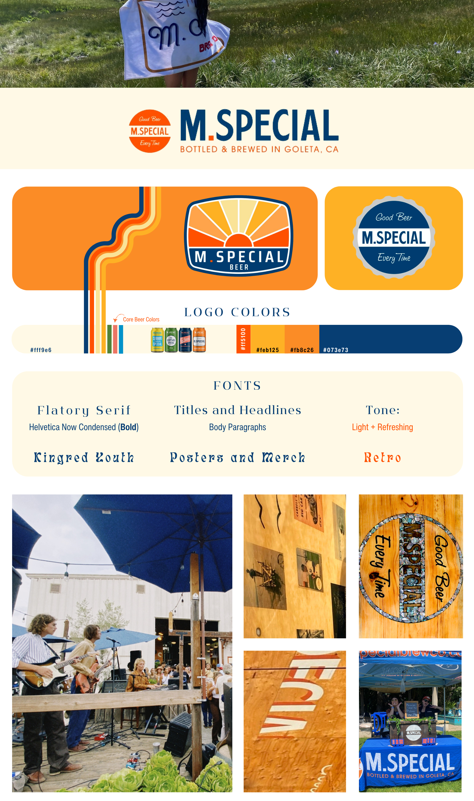
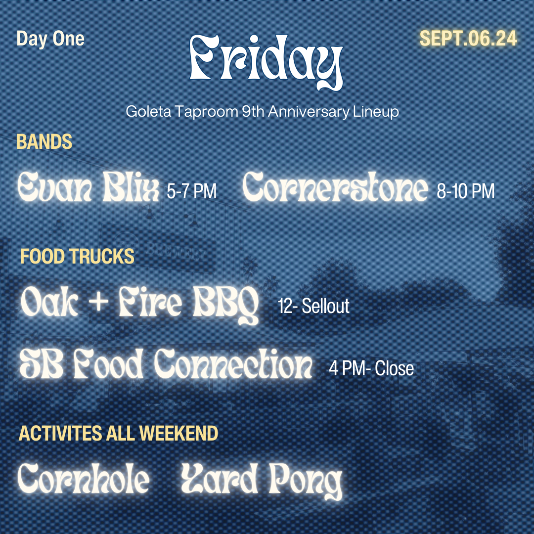

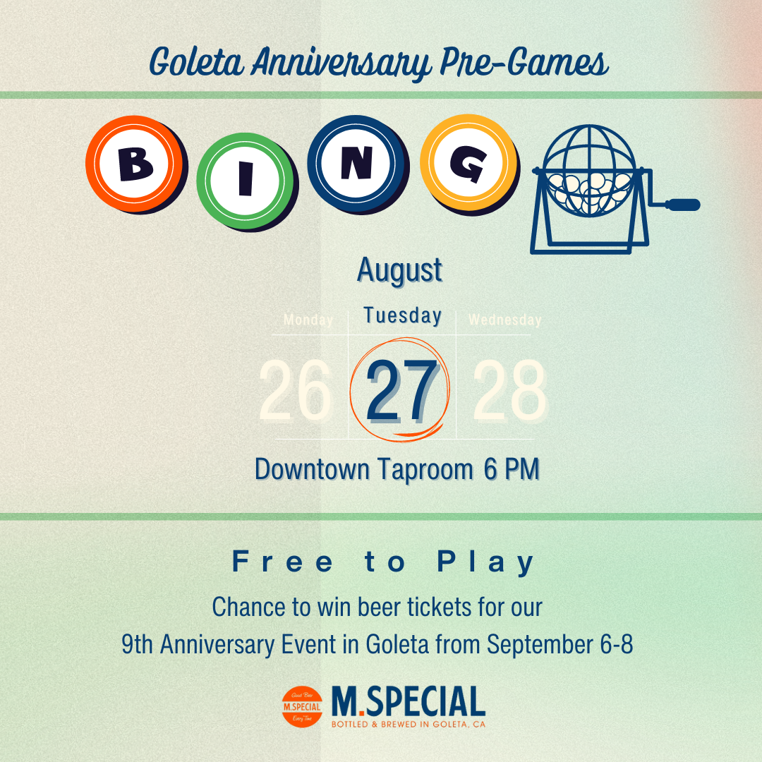
Aside from building out the website and asset library, I’m proudest of my contribution to their design aesthetic. The goal was to incorporate the warm wood tones that accent the physical spaces’ industrial architecture. I took photographs of the countertops and walls of each location so that backgrounds of the taproom pages echoed the taprooms themselves. The company’s logo suite and much of their merchandise is retro, so I used cream to balance those highly saturated colors. See below for how this is applied to social campaigns:
For this craft brewery, we wanted to highlight the owners’ connection to both racing and the entertainment industry. The former is reflected in the website by using content dividers that have a checkered flag design; the latter is represented by a large section featuring the company’s home-brewed YouTube series. These are optimized for community outreach, making contact and calendar information clear for car shows, bands, and film screenings.
I love working with smaller companies or individuals who are trying to strengthen their brand identity. My first task is to sit down with the heart of an operation to better understand their mission, and help them develop consistent visual language that makes their narrative stand out from other businesses in the field.
Original Website
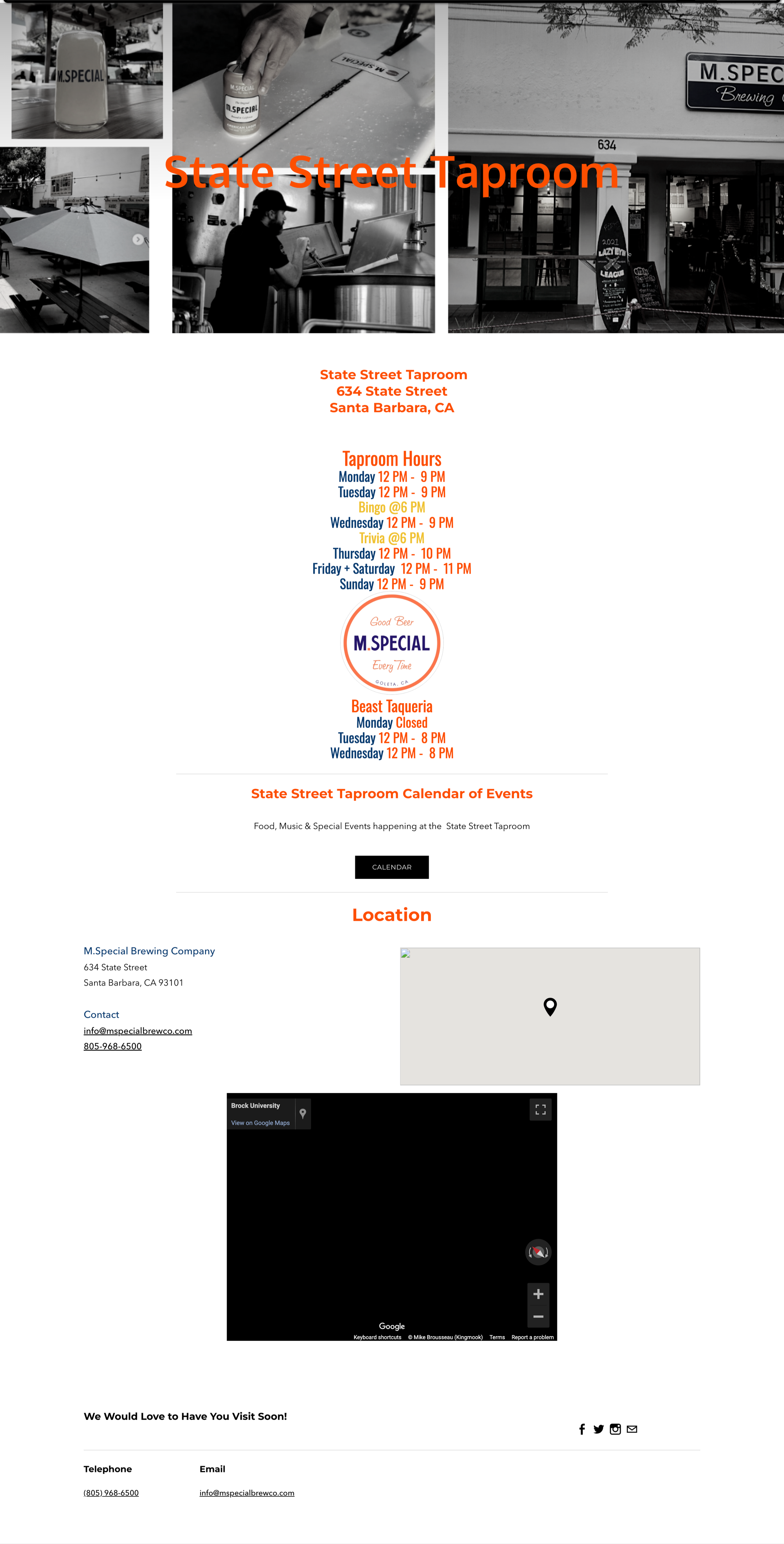
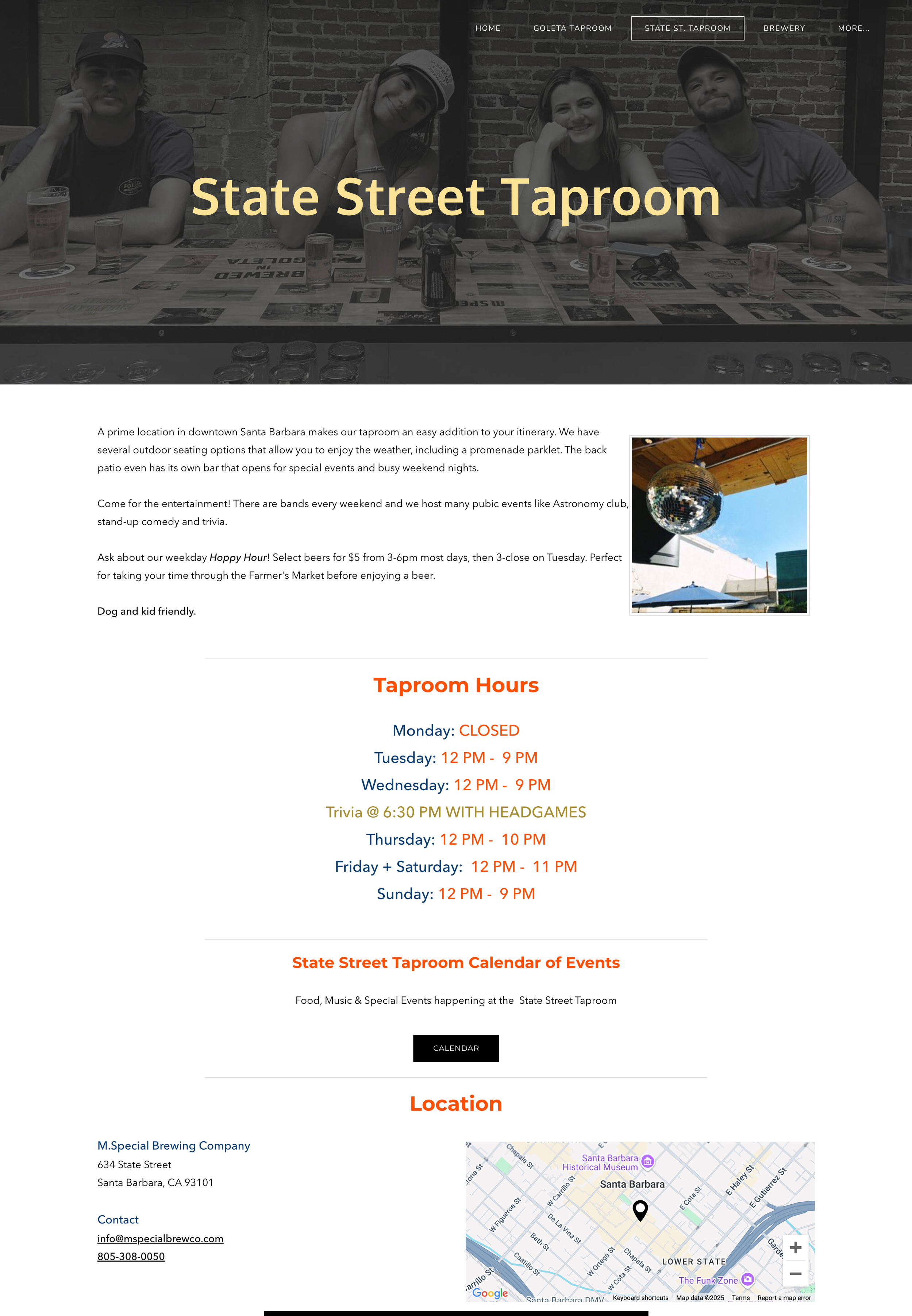
Knowing this website was going to take longer to produce due to our hourly budget and timeline restrictions, I decided to update the existing site first (left image). The right shows the changes below.
Added a navigation bar
Made header images more ADA compliant
Embedded the social media feed and added a newsletter plugin
Created a page for the in-house restaurant
Added introduction paragraphs for each taproom and adjusted the layout so content was more readable
Adjusted SEO meta descriptions and equipped Google Analytics to track site traffic
New Website

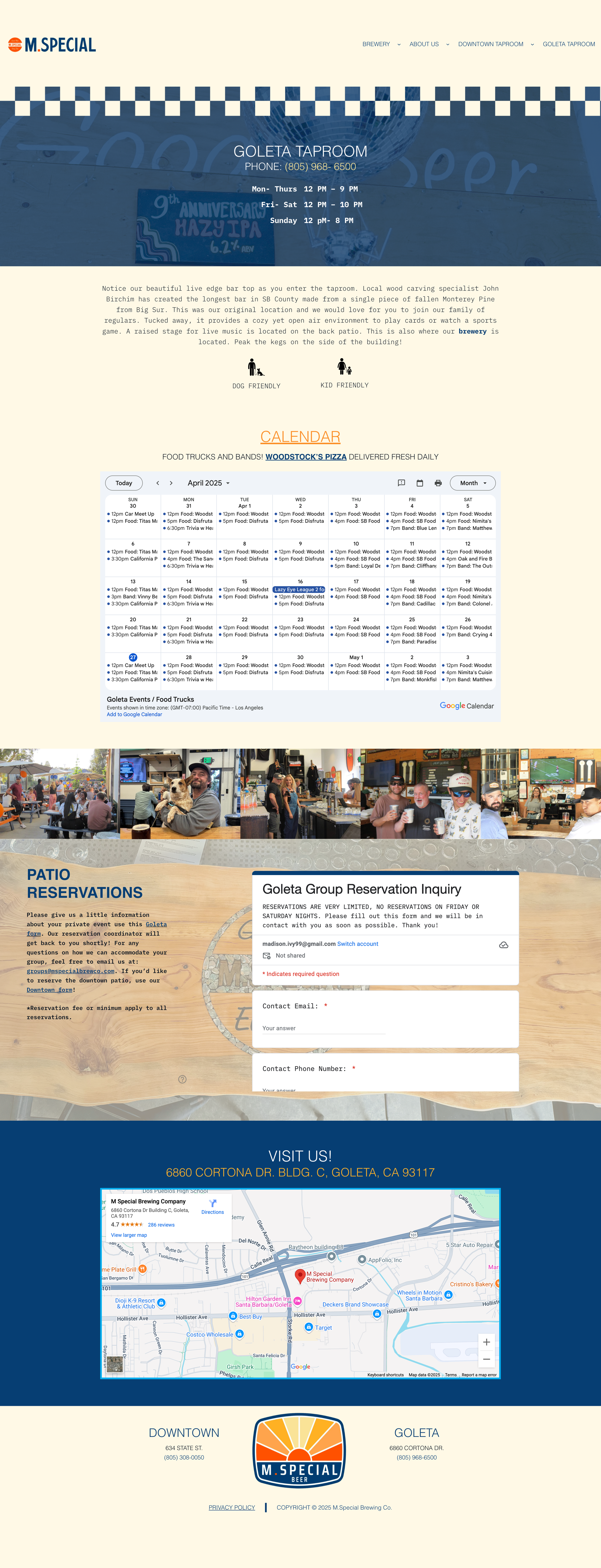

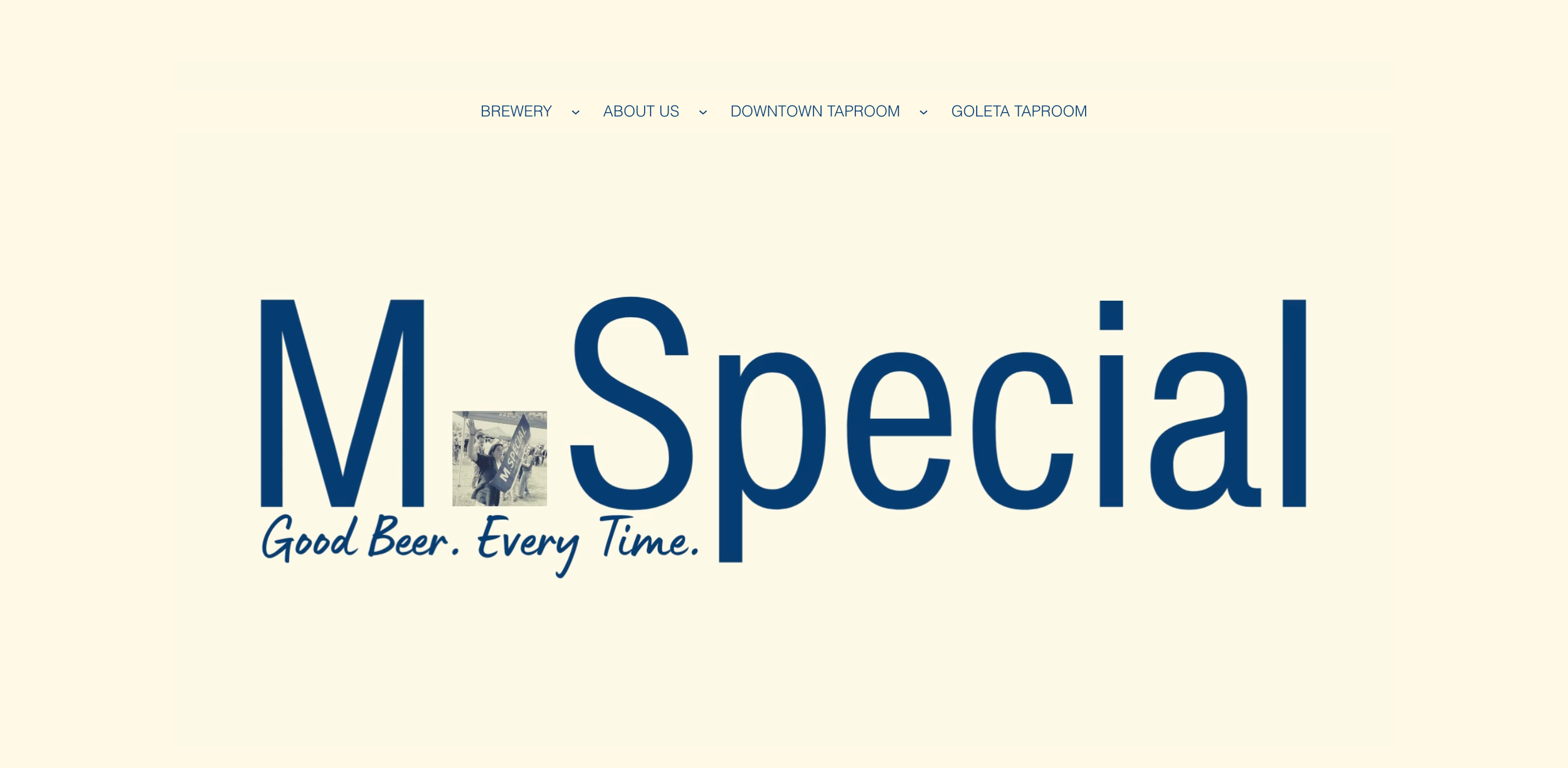
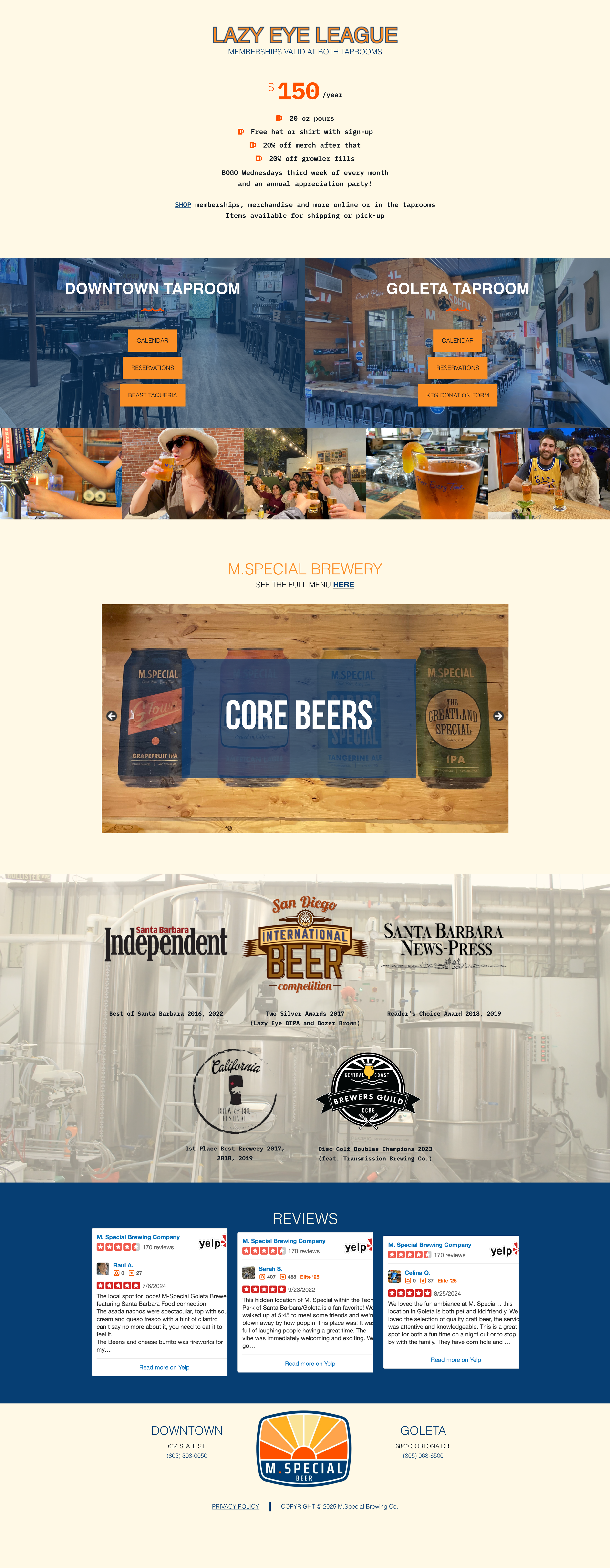

These were attributes of the final website
Created contextual outgoing links to our affiliates
Added privacy policy and copyright information to the footer
Added forms for donation requests and bartender applications
Added sections for awards and reviews
Extended the core menu to include specialty beers, non-beer options, and “archived beer” to show range
Embedded Google calendar so it was interactive/live instead of static
Created profiles for our management and brew staff for personalization
Updated shop page (Square) with: logo that links back to main site, higher quality product photos, membership options, and removed out of stock retail
I wrote the CSS for mobile optimization
Custom Animations
Branding Suites
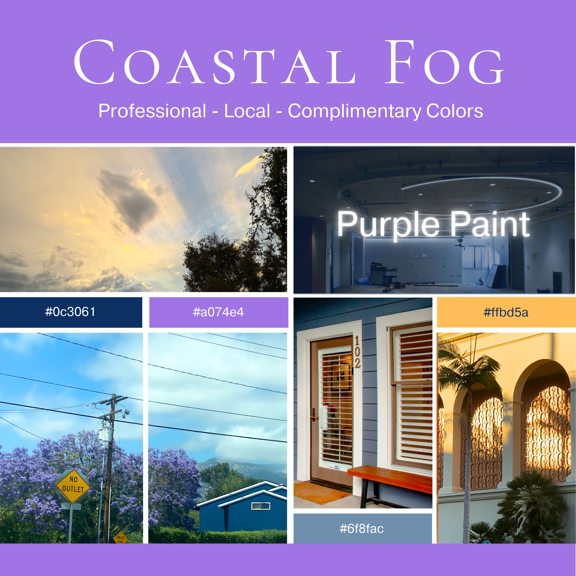
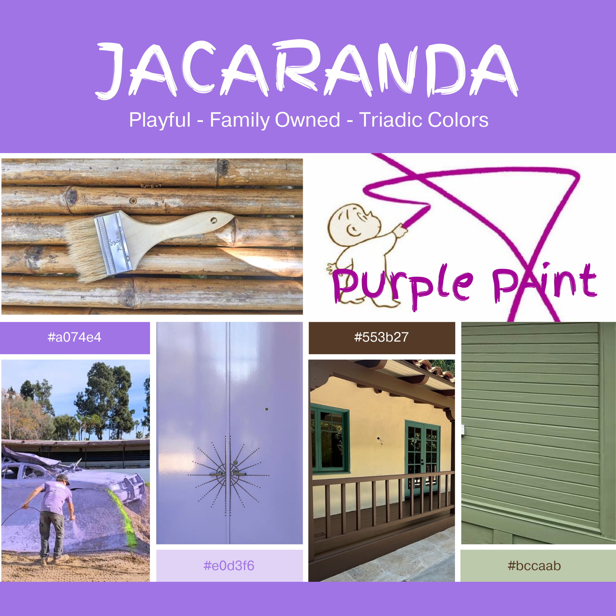
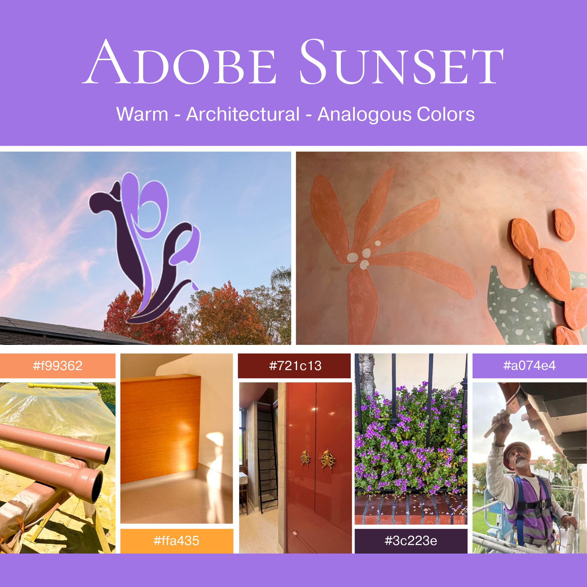
This is another small company I worked with, family-owned and local to Santa Barbara. The only color that they had used consistently was the bright purple shown below. While it definitely helped them stand out from competition, I wanted to give them options to ground it within a larger palette. There was a chance that they didn’t want to settle on one, so part of the consultation was how to apply each. What made it easier was their company having a wide range of services with print packages for each client (brochures, thank-you kits, etc.). If they were to design material based on project type, I advised that they use “Coastal Fog” for commercial, “Jacaranda” for residential, and “Adobe Sunset” for special projects such as cabinetry. However, since they also were large into networking with agencies and real estate agencies that could direct traffic to their business, I mentioned that they could use “Coastal Fog” for partnership presentations and the others for client-facing material.
I also helped this company develop their general marketing system. This included:
Salesmen onboarding
Budgeting and troubleshooting paid ads (Google, Meta, NextDoor, various magazines)
Photography of job sites and client biographies
Website maintenance including SEO and portfolio creation
Logo Redesign
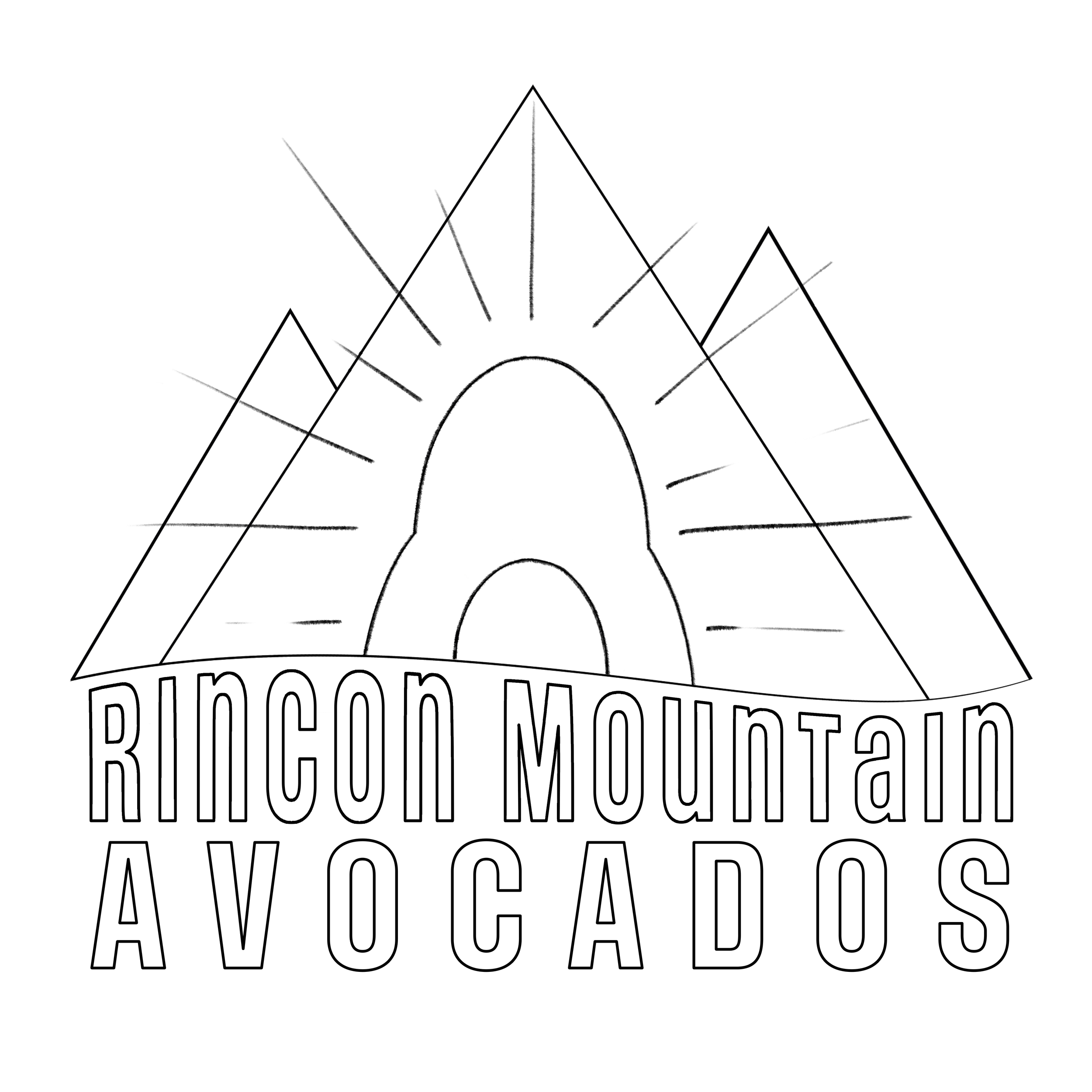
The request was to stick as close as possible to the original design (upper left of the process sheet below), the owner of the company wanting to solely to “clean it up” and make each element more recognizable. This meant redrawing the avocado and reformatting text placement. I gave the client several options, the red indicating what they liked from each sketch.

Print Marketing
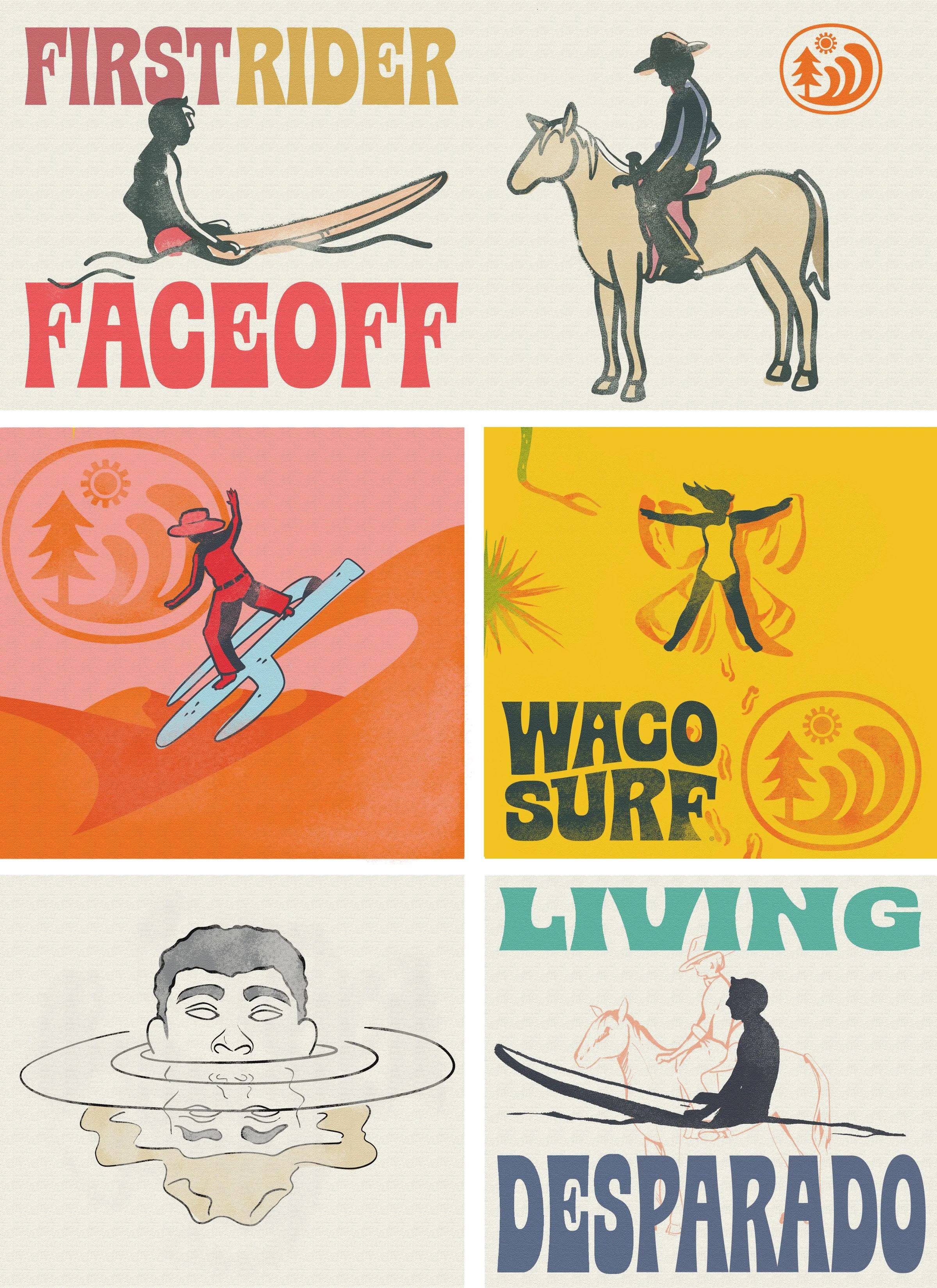
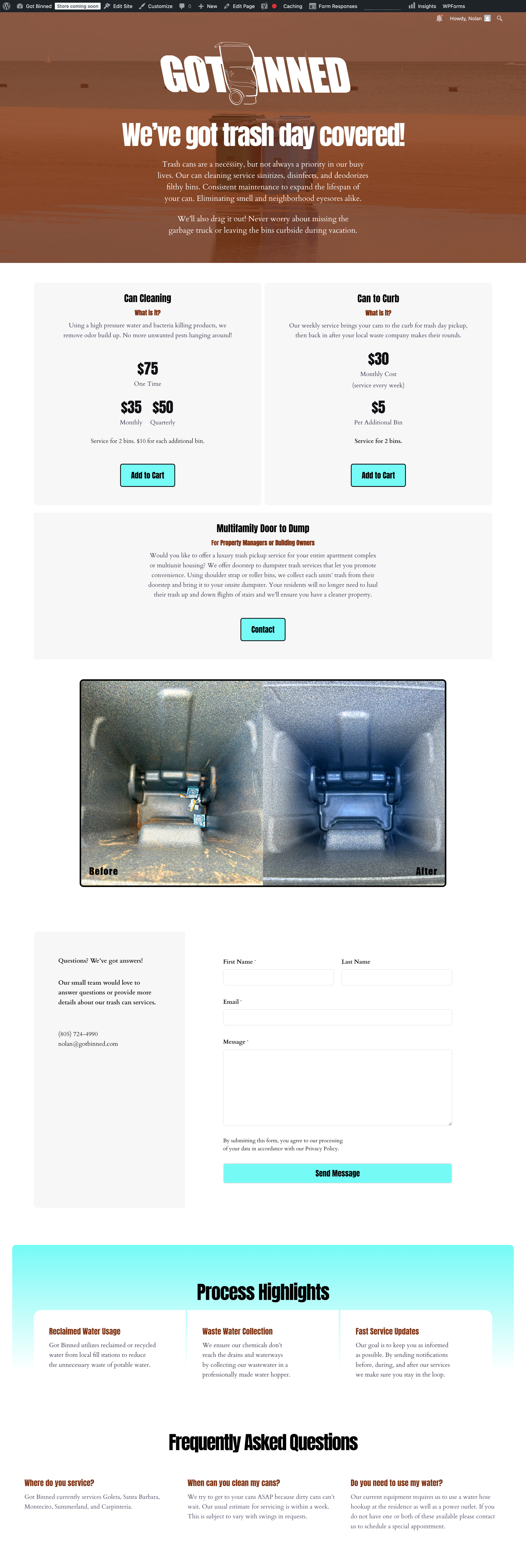

Client Work
Client Work
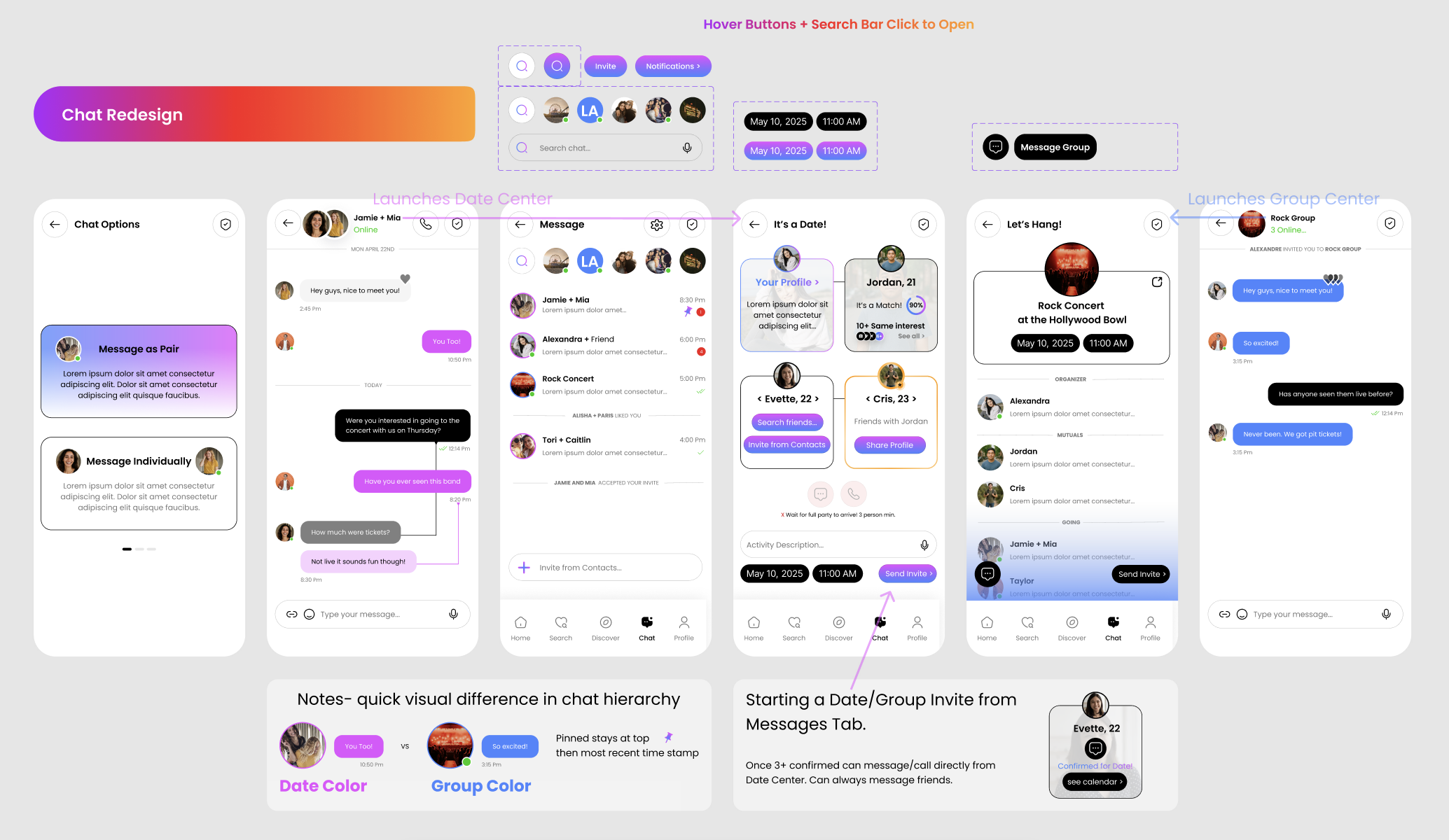
Google Certificate Program
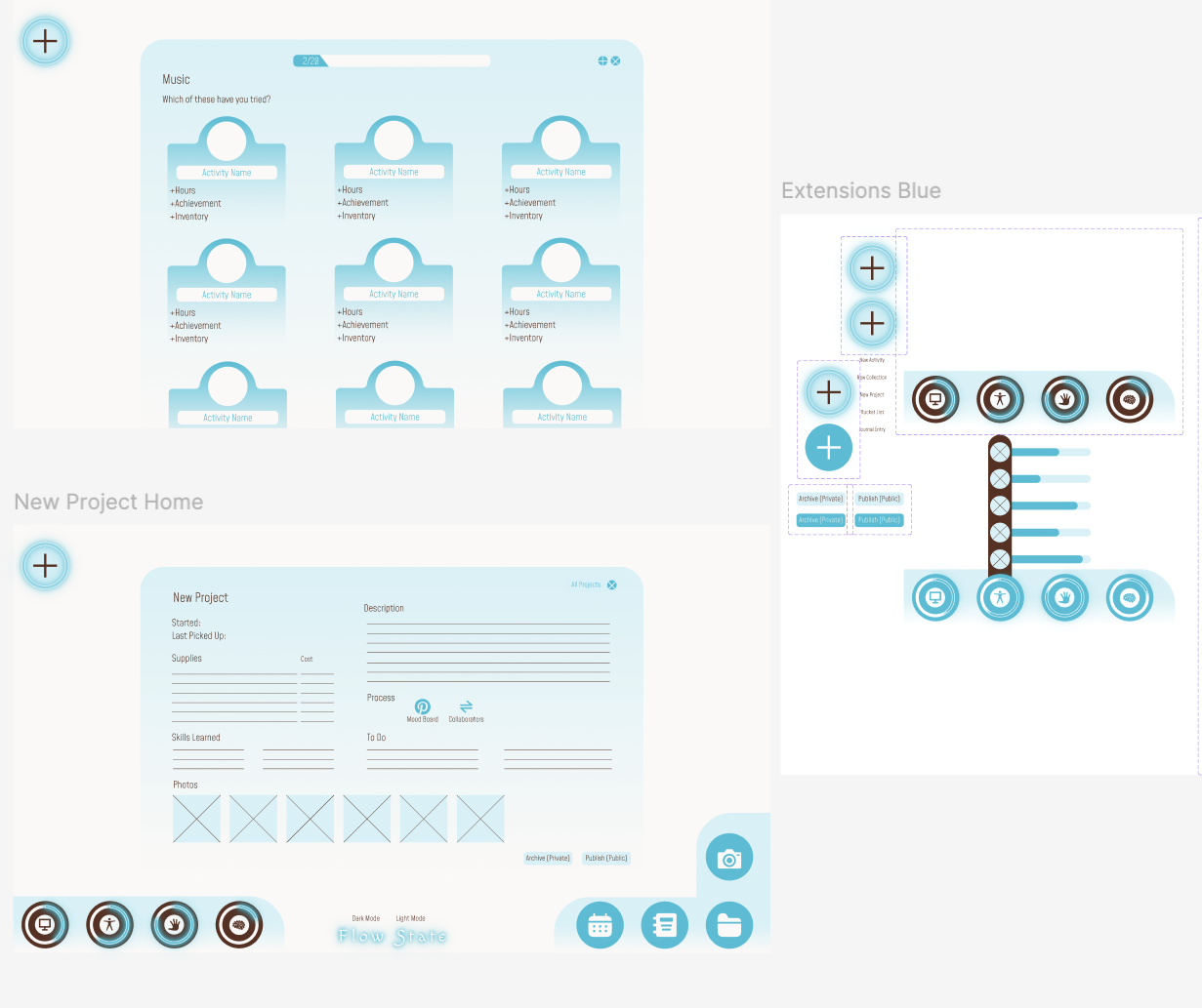
Offered through Coursera, this is the first step I took in learning UX/UI Design
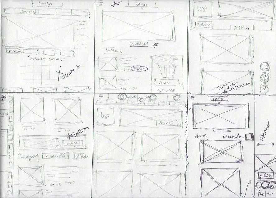
Paper Wireframes
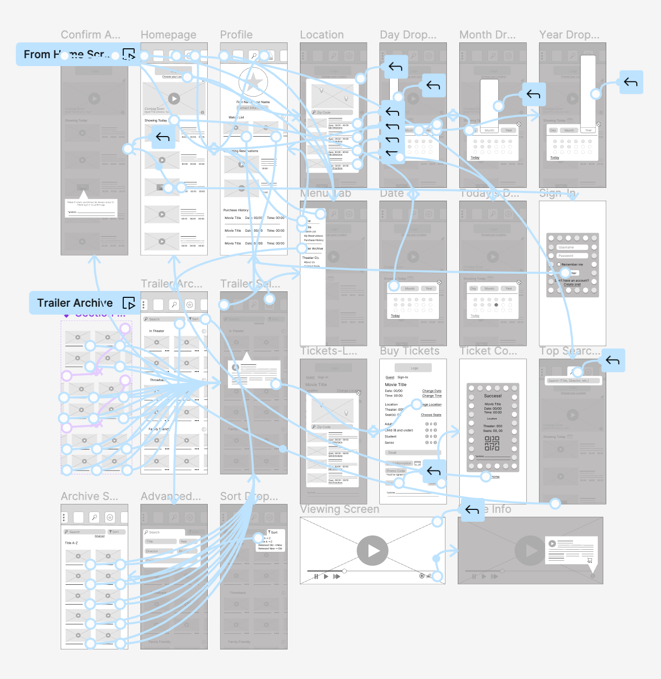
Lo-Fidelity Prototypes

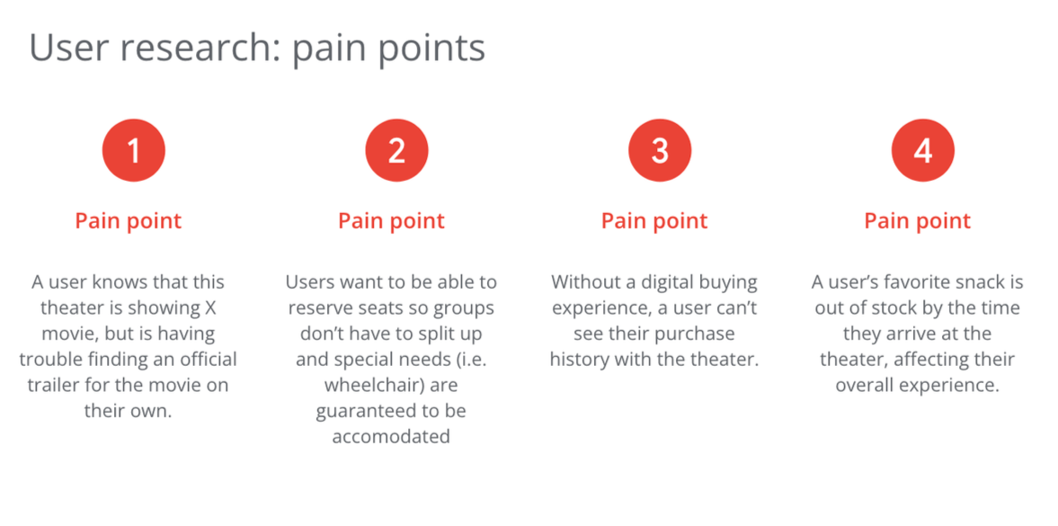
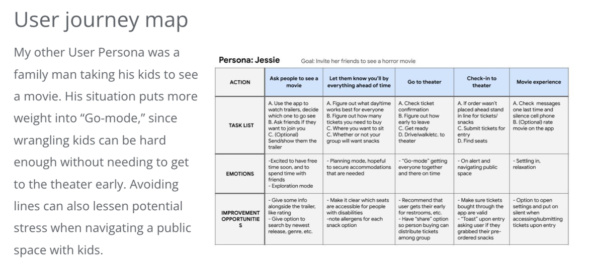
Digital Sketchbook